

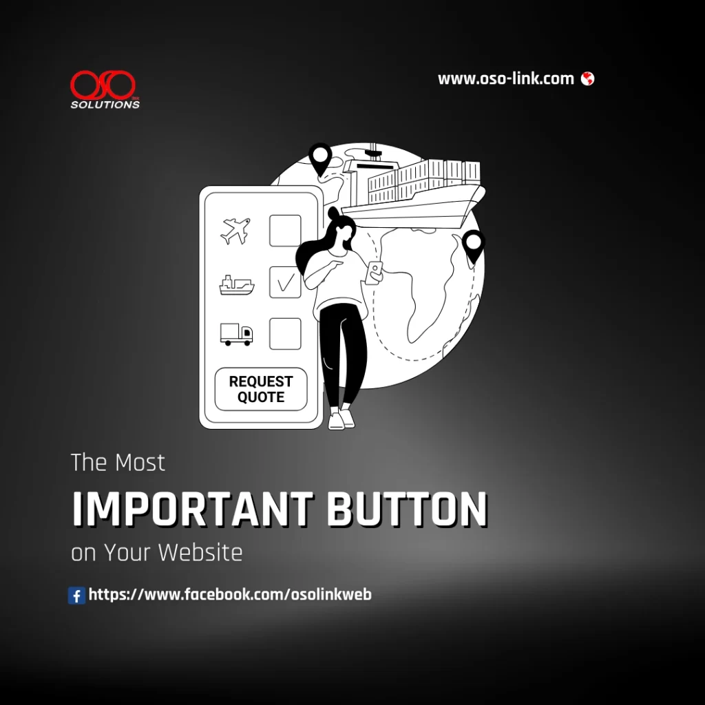
Imagine this: a potential customer visits your website, spends several minutes reading about your services, likes what they see… and then leaves.
What happened?
In many cases, the problem isn’t your design, pricing, or services. It’s that your website never clearly told visitors what to do next.
That’s where your Call-to-Action (CTA) button comes in.
Whether your goal is generating leads, booking consultations, or selling products, the CTA is often the most important button on your website. A well-written CTA guides visitors toward the next step, while a vague one leaves them guessing.
What Is a Call-to-Action?
A Call-to-Action is the button or link that encourages visitors to take a specific action.
Examples include:
- Request a Quote
- Schedule a Consultation
- Book a Free Demo
- Contact Our Team
- Get Started Today
- Download the Guide
- Shop Now
The best CTAs remove uncertainty. Visitors instantly understand what will happen when they click.
Why “Learn More” Isn’t Always Enough
Many websites use generic buttons such as:
- Learn More
- Click Here
- Read More
- Submit
- Continue
While these buttons aren’t technically wrong, they often lack clarity and motivation.
Consider these two examples.
Weak CTA
Learn More
What will visitors learn?
How long will it take?
What happens after they click?
The button creates curiosity but doesn’t communicate value.
Strong CTA
Request a Free Quote
Now visitors know exactly what they’ll receive.
The button answers an important question before they even ask it:
“What’s my next step?”
Clear expectations reduce hesitation and increase conversions.
Compare Weak vs. Strong CTA Buttons
| Weak Button | Strong Alternative |
|---|---|
| Learn More | Request a Quote |
| Contact | Talk to an Expert |
| Submit | Send My Request |
| Read More | Explore Our Services |
| Click Here | Get Started Today |
| More Info | Schedule a Free Consultation |
| Buy | Order Now |
| Sign Up | Create My Free Account |
The stronger version focuses on the visitor’s goal instead of using generic language.
Make Your CTA Customer-Focused
One of the biggest mistakes businesses make is writing buttons from their own perspective.
Instead of thinking about what your business wants, think about what your customer wants to accomplish.
For example:
Instead of:
Submit
Use:
Get My Free Estimate
Instead of:
Contact Us
Use:
Let’s Discuss Your Project
Visitors respond better when the action reflects the benefit they’ll receive.
Keep It Visible
Even the best CTA won’t work if visitors can’t find it.
Your primary CTA should appear:
- Near the top of your homepage
- After explaining your main service
- At the end of important sections
- On every service page
- In your website header or navigation when appropriate
For longer pages, repeating your CTA naturally helps visitors take action whenever they’re ready.
Design Matters Too
Your CTA should stand out without overwhelming the page.
Best practices include:
- Use a contrasting button color.
- Keep button text short and easy to read.
- Make the button large enough to tap on mobile devices.
- Leave enough white space around it.
- Avoid placing multiple competing CTAs side by side.
Remember, the goal is to guide visitors—not distract them.
Match the CTA to the Visitor’s Intent
Different pages serve different purposes, so your CTA should match the visitor’s stage in the decision-making process.
Homepage
- Request a Quote
- Schedule a Consultation
Service Pages
- Get a Custom Proposal
- Contact Our Team
Blog Posts
- Read Related Articles
- Contact Us for Expert Help
Portfolio Pages
- Start Your Project
- Request a Consultation
When the CTA aligns with the visitor’s intent, they’re more likely to take the next step.
Common CTA Mistakes
Avoid these common issues:
- Using vague wording.
- Having too many primary buttons on one page.
- Hiding the CTA below the fold.
- Using low-contrast colors that blend into the background.
- Asking visitors to complete lengthy forms before they’ve built trust.
A simple, clear CTA often performs better than a complicated one.
Key Takeaways
Your website’s most important button isn’t necessarily the biggest one—it’s the one that clearly tells visitors what to do next.
Remember these principles:
- Be specific instead of generic.
- Focus on the visitor’s benefit.
- Use action-oriented language.
- Make your CTA easy to find.
- Match the CTA to the page’s purpose.
Small improvements to your call-to-action can lead to significant increases in enquiries, bookings, and sales.
Ready to Improve Your Website?
A successful website doesn’t just look professional—it guides visitors toward meaningful action.
At OSOlink Solutions, we design websites that combine modern design, fast performance, and strategic calls-to-action that help turn visitors into customers. Whether you need a new website or want to improve your current one, we can help you create an online presence that works for your business.
Don’t let potential customers leave without taking the next step. Build a website that encourages action from the very first click.